Pursuit of Perfection
 dmitshur
Apple is known as a company that strives for perfection in everything they do. They place a lot of attention on getting the smallest of details right. The little things that you rarely notice, not until you see someone else doing it wrong.
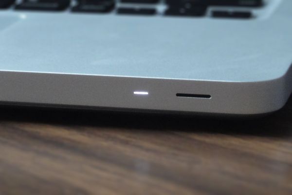
This attention to detail shows up everywhere. Take the power indicator on a MacBook for instance. It is meticulously programmed to light up in a solid white color only when the following two conditions are met:
- The MacBook is turned on
- Its LCD screen is not lit up
This ensures you can tell whether the computer is turned on at all times, yet the indicator light is never on when it would be redundant. After all, if the LCD is on, you will already know that the computer is on.
iOS is a fine example of high-quality Apple software. It's not always perfect, but the level of polish is above and beyond what you typically find in this very young but fast growing mobile industry. However, one of the side-effects of highly polished software is that when there are flaws in it, they become quite glaring in contrast to everything else that is done well.
There is one such flaw that I've found. Being able to tell the time on your phone is quite important, that's why it always takes its place front and center in the middle of the status bar.

When an iPhone is locked, time and date are displayed in a large font. To avoid displaying the time twice, needlessly, time within the status bar is replaced by a small lock icon.

The problem occurs when you get a call while your device is locked.

At this point, you lose the ability to find out the time until you respond to your phone call.
It's not a big deal, but I've found myself quite jarred by this a few times recently, when I wanted to find out the time before picking up the call.
Update: This has been fixed in iOS 6.0.